top of page
Converting mobile screens to desktop
Challenge:
To make sure that a payment flow is as intuitive as possible while the user can easily keep track of all of the most important information.

"Pay to" screen
Features to keep in mind:
-
Check info about each payment destination
-
How to make a specific payment
-
Give the user a sense of navigation

-
The user can expand an object to check info about a payment destination
-
The user must select destination by clicking the circle next to it
-
The user must select "Pay" button to advance
-
The left column allows the user to track progress of process in payment
Changes made:

"Information" screen
Features to keep in mind:
-
Ability to see which account the payment is coming from, and the destination
-
Ability to enter and calculate entire payment
-
Ability to change the date of payment, occurrence, and add notes

-
User can change the account and payment destination by selecting from a dropdown
-
User enters amount to pay. Service fee is shown, and the total is shown in larger font
-
User can type in notes, change payment occurrence by selecting from a dropdown, and change the date of the payment by clicking to bring up a calendar
Changes made:

Calendar screen
Had to figure out a way bring the calendar to desktop

Change made:
The calendar pops up as an overlay. The user can cycle through months, select a date, and click "Choose this date". This allows the user to select a date without having to navigate back and fourth between screens.
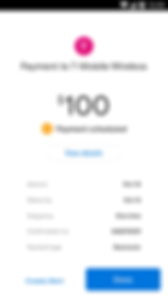
"Verification" screen

Change made:
After doing some usability testing, my key finding was that the total payment and confirmation number were the two things users looked for the most. While setting up hierarchy, I decided to make those two elements the largest.
bottom of page